User Account Menu Redesign | Spoonflower

The problem:
Logged in users had access to a special user account menu, but over the years it had become a catch-all list that lacked organization and a clear sense of hierarchy. There had been a recent uptick in feedback from both customers and internal teams that they were struggling to access frequently visited pages easily from the menu.
The Goal:
Condense the user menu by removing any obsolete or duplicate pages while adding links to frequently used pages that were difficult to access. Introduce a stronger hierarchy by grouping like items and personalized menus based on the user type to encourage design upload.
The Process (2-4 months):
Researched and gathered examples of user menus from other sites.
Pulled data on the current user menu and looked at ways to consolidate the list based on the user data and feedback.
Experimented with different menu layouts as well as the order of items.
Sketched and created mockups in Sketch, worked through rounds of feedback collaborating with stakeholders and the Product team.
Provided high-fidelity mockups to the Engineering team to implement and provided feedback as well as QA support while it was being built.
Initial Research & Making Data-Driven Decisions
Analyzed data on menu items in the user account drop down looking at the past 10 months worth of clicks and ranked them based on number of click events. Then I began working through how we could consolidate items and simplify the list based on the data:
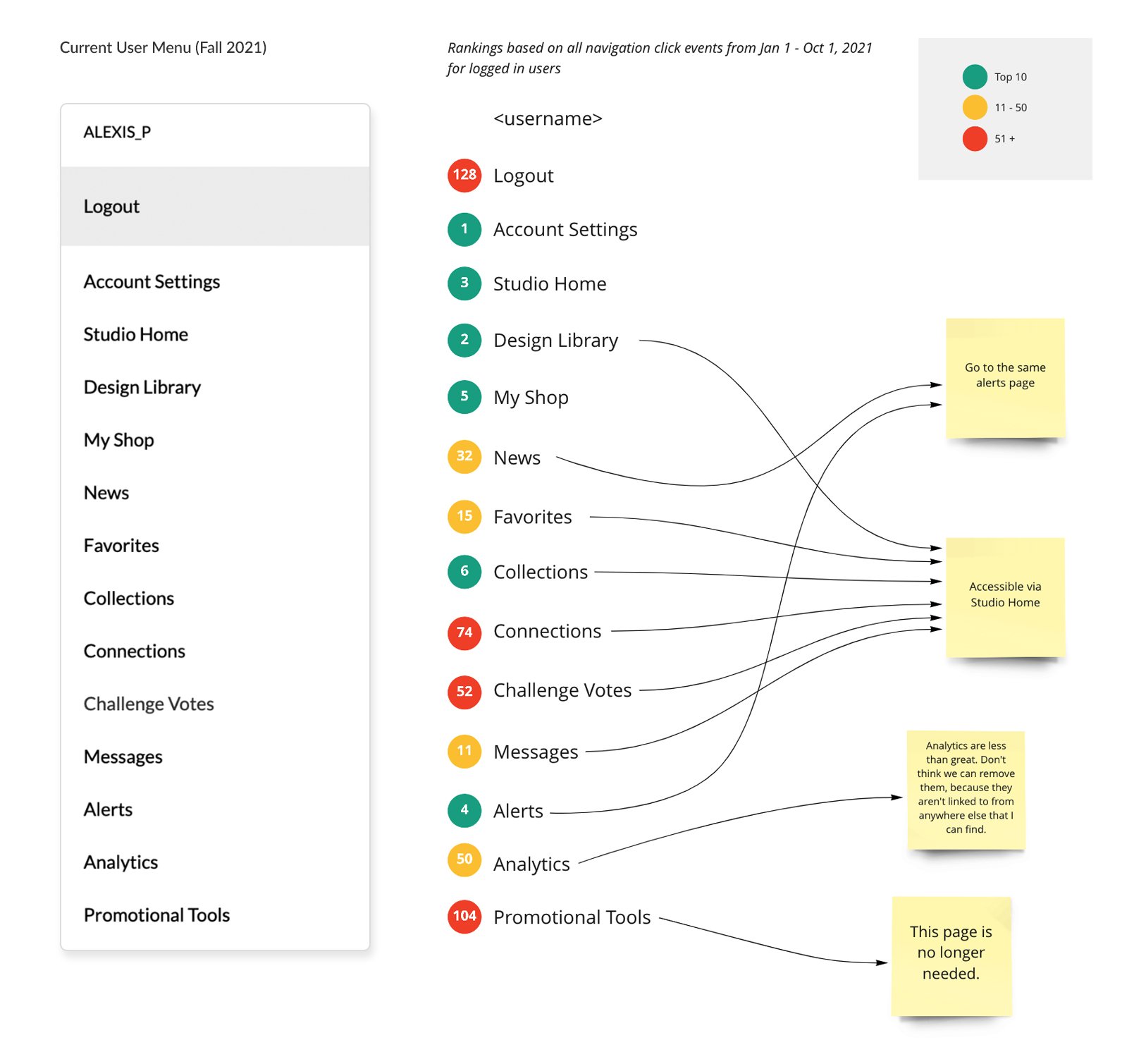
Afterwards I began coming up with initial ideas for an updated menu and mapped the current menu to it to ensure we were accounting for new and currently pages while removing duplicate or obsolete pages. Also played around with updating the language of some of the menu items to make them more clear.

Finalized the menu items and created two unique versions; one for users with designs uploaded to their account already and one for users with no designs uploaded.

User Drop Down Menu Mockups
Created finalized mockups showing the different variations based on user type and account activity:

Logged in user with no designs uploaded

Logged in user with designs uploaded

Logged in user with designs uploaded and notifications
The Solution:
Simplified the user drop down and added links to important pages that were previously missing. Created a clear call to action for users to upload designs. While the mockups show a headshot and the ability to edit profile settings at the top of the menu, these features were ultimately removed when the menu was implemented due to time restrictions and technical limitations. The hope is that in a future iteration we’ll be able to add it in, but in the meantime the new list is straight forward and easy to navigate.
